


Clooney, an upmarket restaurant in Auckland, needed to update their brand. We tapped into the experience inherent in their name by using cinema as an inspiration.
Cinema embodies the same traits Clooney does – it can be intriguing, exclusive, international, and dramatic. Like Clooney, it’s an experience. All aspects of the design came from that insight.
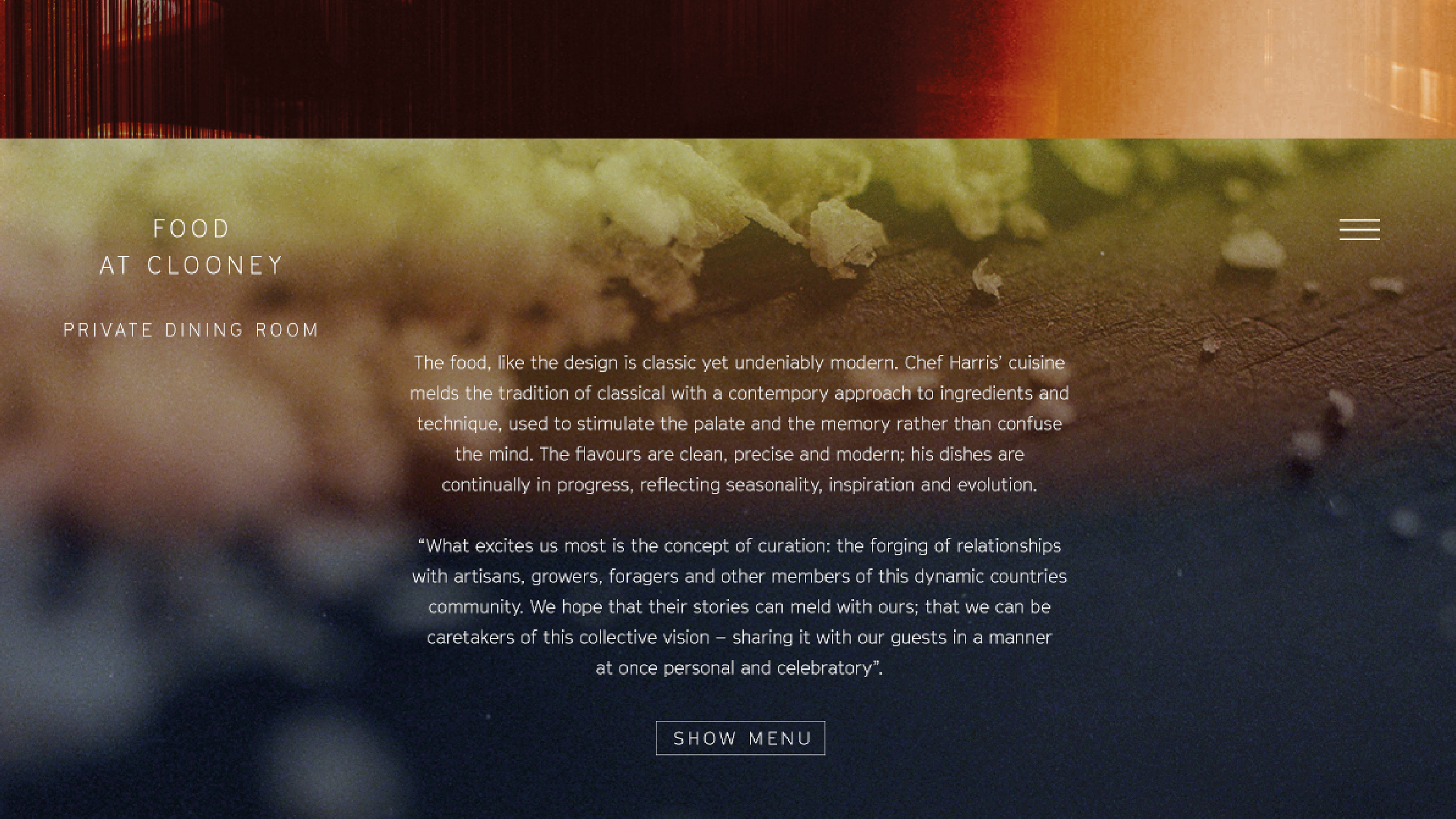
Clooney's dark, moody lighting and industrial bare walls were perfect for projecting moving images, while the new typeface, GT Cinetype, is based on a design engineered for a cinema subtitling machine.
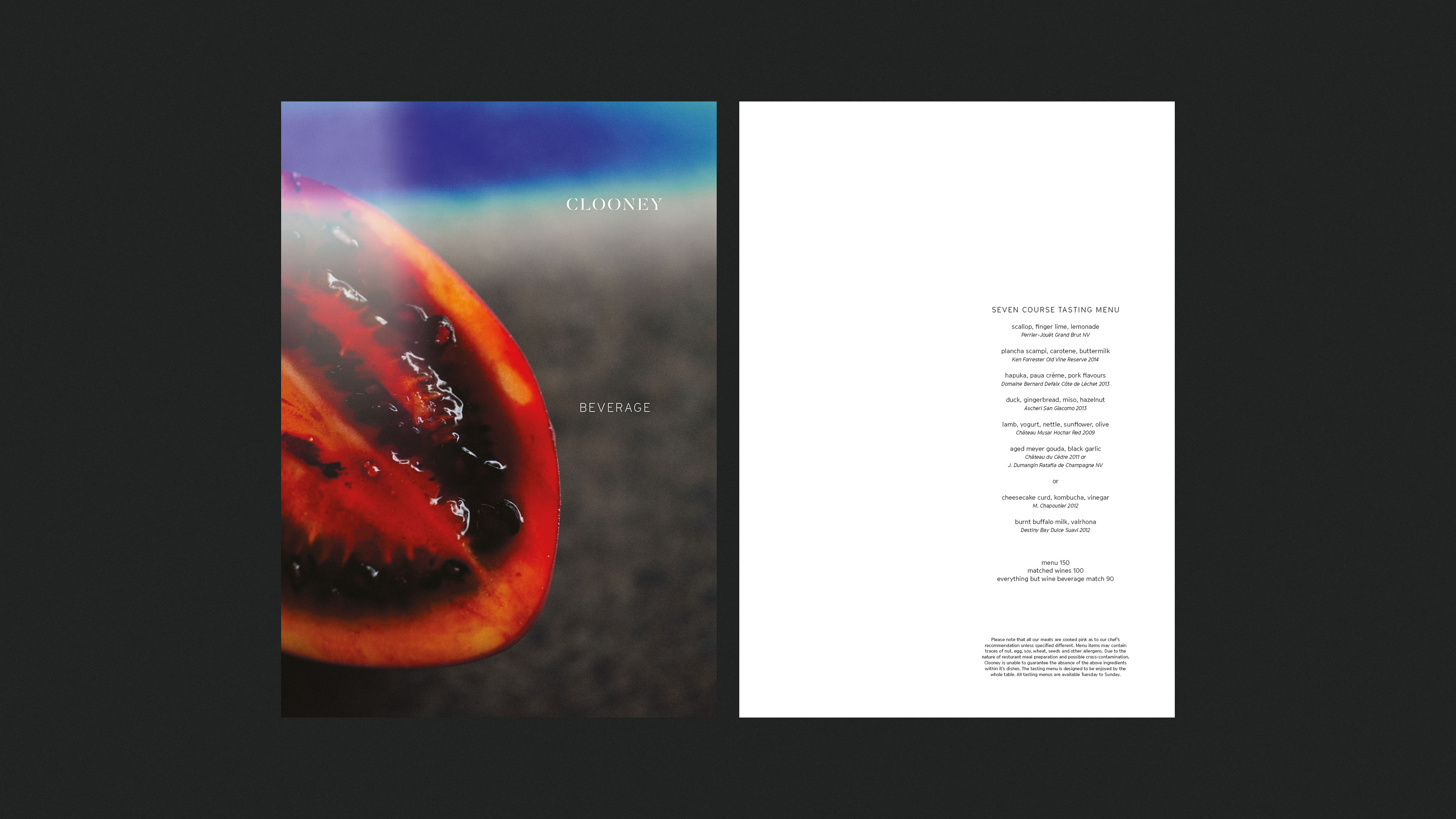
The new logo strikes a balance between the classic timelessness of a serif typeface, and the street feel of stencil art. Its disappearing letterforms give it a hint of mystery and danger, as well as evoking the manual cutting of film, much like the slicing of food.
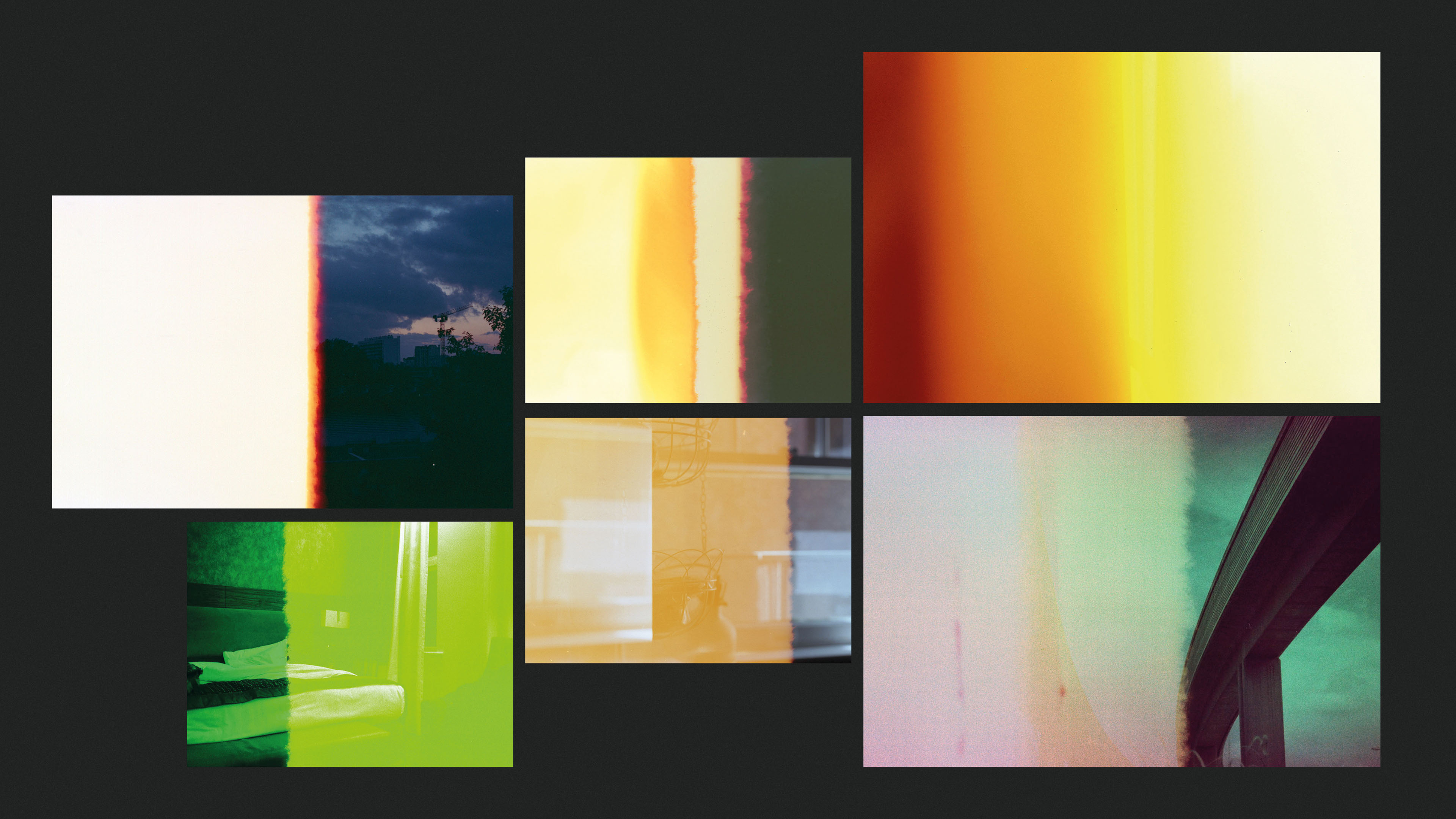
Finally, the photography is informed by the light leaks found at the end of film rolls. The idea of Clooney living on the edges, where it’s just a bit dangerous, also fits the brand’s ideology. Plus it’s reminiscent of the colour of food, like a brushstroke of sauce on the plate.
Agency: Y&R NZ